

Cannabis Marketing Website: Layout That Gets More Online Orders
If your cannabis website looks good but doesn’t convert, the issue is usually the layout—not the products. People who buy online want three things fast: find the right item, trust the store, and complete checkout with minimal friction. Your layout should be built like a guided path from “I’m browsing” to “Order confirmed.”
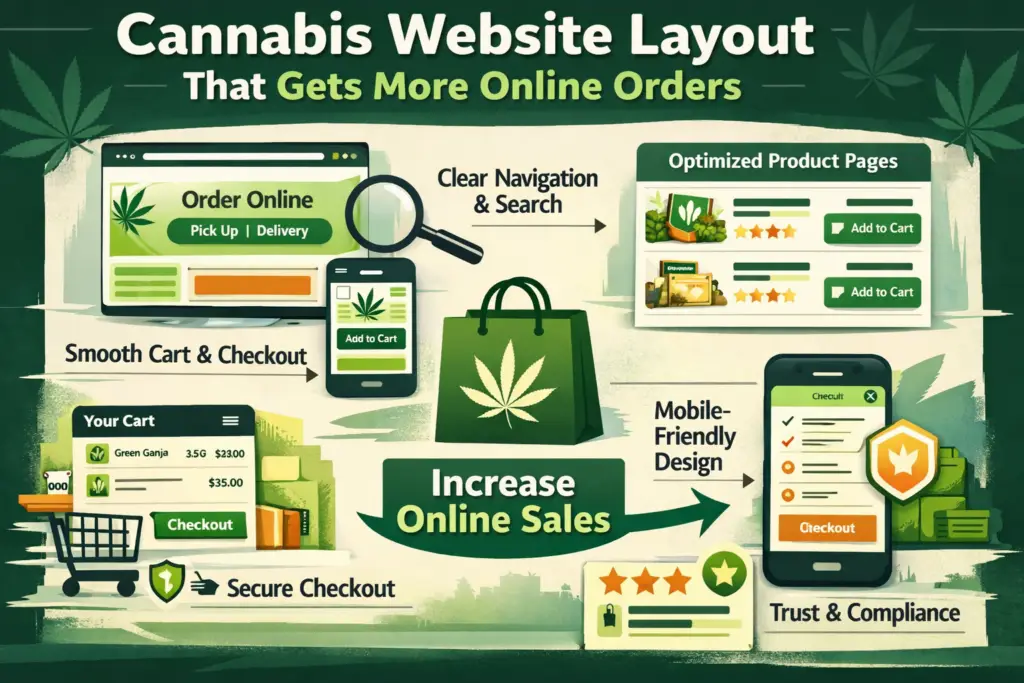
Below is a proven website layout framework (homepage → menu → product → cart → checkout) designed to increase online orders for dispensaries and cannabis brands—especially on mobile.
1) Above-the-fold: Make the next step painfully obvious
The top of your homepage should answer, instantly:
- What do you sell?
- Where do you serve?
- How do I order right now?
Layout formula (top section):
- Left: headline + 1-line value prop
- Center/right: “Order Online” primary button (sticky on mobile)
- Under it: Pickup / Delivery toggle + location selector (if relevant)
- Trust row: star rating, number of reviews, hours, “licensed retailer” style credibility cues
This is not the place for long brand stories. The hero section should behave like a “start ordering” ramp.
2) Navigation that prioritizes ordering (not exploring)
A high-converting cannabis site typically uses a simple, order-first navigation:
- Order Online (primary)
- Deals
- Categories
- Locations (if multi-store)
- Support / FAQ
Keep it short and reduce decision fatigue. If you have a large catalog, add a prominent search bar and category shortcuts (Flower, Vapes, Edibles, Concentrates, Pre-Rolls, Topicals).
Ecommerce UX research consistently shows that unclear product discovery and weak product-page structure cause users to abandon otherwise “good” products.
3) The menu/category page is your “money page”
Most cannabis online orders are won (or lost) on the product list/menu page.
What your category/menu layout needs:
- Persistent filters (Type, Potency/THC range, Brand, Price, Effects, Specials)
- Sort options (Best sellers, Price low-high, New, Highest rated)
- Large product cards with:
- Product name + brand
- Price + deal badge
- Potency range (clear and consistent)
- Size/weight
- Primary CTA: Add to Cart
- Secondary: View Details
Baymard’s benchmarking highlights that many stores have “mediocre” product page UX and that fixable layout issues can cause users to abandon suitable items.
If you’re embedding a menu provider, follow their layout best practices so it stays full-width and responsive (and doesn’t get cramped on mobile).
Helpful reference: Leafly embedded menu tips and implementation docs can guide how your menu displays cleanly on your site: Leafly Embedded Menus Best Practices
4) Product detail page: Remove doubt, then present one clear action
Your product page should be built to answer objections quickly:
Recommended product page sections (top to bottom):
- Gallery (real images if possible)
- Name + brand + potency + size
- Price + promo + loyalty note (if applicable)
- Primary CTA: Add to Cart (sticky on mobile)
- Key info blocks (effects, flavor/aroma, strain type, cannabinoids, terpenes)
- Social proof (reviews, “popular choice,” best-seller badge)
- Fulfillment clarity (pickup/delivery, ETA, requirements)
- Suggested alternatives (similar products, bundle pairings)
Nielsen Norman Group found that product pages work best when they provide clear, complete product information and support decision-making—especially when users are comparing options.
Helpful reference: NN/g: UX Guidelines for Ecommerce Product Pages
5) Cart design: Reinforce confidence and reduce last-second friction
Think of the cart as the final “review and confirm” step. Your cart layout should include:
- Item image + name + key attributes (weight, potency, variant)
- Easy quantity controls
- Clear subtotal + taxes/fees messaging (as applicable)
- Pickup/delivery selection (and address confirmation)
- “Continue Shopping” link (small) and Checkout button (dominant)
- Trust reassurance: secure checkout, support contact, return/exchange policy if applicable
When shoppers make final decisions in the cart, clear summaries (with images and attributes) help them verify they’ve chosen correctly.
6) Checkout: Fewer steps, fewer fields, fewer surprises
Checkout is where revenue leaks happen.
A high-performing cannabis checkout layout:
- Keeps checkout to 1–2 pages if possible
- Uses autofill-friendly fields
- Shows total cost early (avoid surprise fees at the end)
- Prominently displays pickup/delivery details
- Includes clear error messages and field validation
- Reinforces trust and policy info without distracting from completion
Shopify notes that reducing cart abandonment often comes down to removing friction and increasing clarity during checkout.
Helpful reference: Shopify: Reduce Cart Abandonment by Optimizing Checkout
Also worth noting: many leading ecommerce sites still perform “mediocre” or worse in checkout UX—meaning small layout improvements can create real conversion gains.
Helpful reference: Baymard: Current State of Checkout UX
7) Trust and compliance cues (without killing conversions)
Cannabis shoppers want to feel safe and legit—especially first-timers.
Add these layout-friendly trust elements:
- Age/eligibility notice (simple, not intrusive)
- License / compliance note in footer
- Clear fulfillment rules (pickup ID requirements, delivery radius)
- Support options (chat, phone, email) visible but not distracting
- Privacy/security reassurance near checkout
The key is to place compliance information where it supports confidence—footer, cart, checkout—not where it blocks browsing.
8) Mobile-first conversions: Sticky CTAs win
Most cannabis traffic is mobile. Your layout should include:
- Sticky “Order Online” button on homepage
- Sticky “Add to Cart” on product pages
- Thumb-friendly filters (bottom sheet filters work great)
- Fast-loading menu pages (optimize images, reduce heavy scripts)
If your menu is hard to filter on mobile, conversion drops fast—because users can’t “work” to find the right product.
9) A simple “conversion stack” to add to your layout
These are layout modules that tend to lift online orders:
- Deals hub (best discounts + daily specials)
- Best sellers section (removes choice overload)
- Recently viewed (brings users back to items they considered)
- Bundles / pairings (pre-roll + lighter, gummies + sleep, etc.)
- Reorder button for returning customers (huge for repeat revenue)
Final takeaway: Build the website like a guided ordering path
If you want more online orders, stop thinking “pages” and start thinking “flow”:
Homepage → Menu → Product → Cart → Checkout
Each step should reduce confusion, increase trust, and keep one primary action in focus.
Grow Your Cannabis Company Today!
Let’s take your business to the next level—connect with us today.