

The Best Dispensary Website Layout for More Online Orders
If your dispensary website looks good but online orders are low, the problem is usually layout—not your traffic. In 2026, customers shop dispensaries on their phones like they shop food delivery: fast, simple, and with zero friction. The dispensaries winning online ordering have one thing in common: their websites are built to guide buyers to checkout in a few taps.
Below is the best-performing dispensary website layout (plus the exact sections to include), so you can increase online orders, average cart size, and repeat customers—without redesigning your whole brand.
The Goal: Reduce Friction, Increase “Add to Cart”
Your layout should answer four questions instantly:
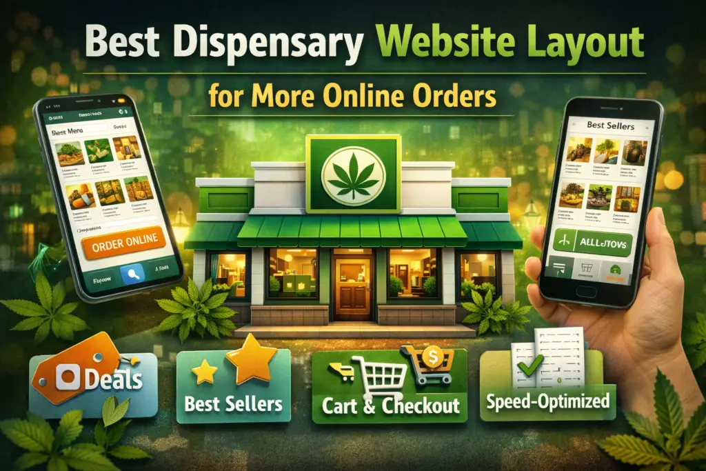
- Can I order online right now?
- What are the best deals / best sellers?
- Can I quickly find what I want (category, effect, brand, price)?
- Is this place trustworthy (reviews, policies, clear pickup info)?
Every extra click or scroll costs you orders. That’s why the best layouts are simple, mobile-first, and focused on a single action: add to cart → checkout.
The Highest-Converting Dispensary Website Layout (Section by Section)
1) Sticky Header That Drives Orders
Your header should stay visible as users scroll and include:
- Order Online button (primary CTA)
- Menu link
- Deals link
- Search icon (product search)
- Cart icon (with item count)
Keep it minimal. Too many links kills conversion.
Pro layout rule: The “Order Online” CTA should never be more than one tap away.
2) Above-the-Fold Hero That Does One Job
Above the fold means what users see without scrolling. Here’s what belongs there:
- Headline: clear and local
“Order Pickup in Minutes — [City] Dispensary” - Subheadline: one trust statement
“Fast pickup • Great deals • Top-rated locally” - Primary CTA: Order Online
- Secondary CTA: View Deals
- Optional: “Open Now” + today’s hours
Avoid long paragraphs, huge sliders, and stocky “brand story” up top. Save that for later.
3) Deal Tiles + Best Sellers (Your Fastest Revenue Blocks)
Right after the hero, place two blocks:
- A) Today’s Deals (3–6 tiles):
- “Daily Specials”
- “First-Time Customer Deal”
- “Bundle & Save”
- “Happy Hour” (if used)
- “Under $25” / “Best Value”
- B) Best Sellers (8–12 products):
- Show real product cards with price + THC/CBD (if applicable) + quick add button
These two sections typically drive the most clicks because they match high-intent behavior: customers want value and proof.
4) Menu Navigation That Feels Like a Shopping App
Your menu page should feel like a modern storefront—not a long, slow list.
Recommended menu layout:
- Category tabs (Flower, Vapes, Edibles, Concentrates, Pre-Rolls, Topicals, CBD)
- Filters (Price, Brand, Potency, Weight, Type, Effects if you support it)
- Sort options (Best selling, Price low-high, New, Featured)
- Search bar at the top
This is where many dispensary sites lose orders: the menu is cluttered, slow, or impossible to filter on mobile.
Checkout research consistently shows how small UX issues reduce conversions—especially around product discovery, cart, and checkout clarity. (Baymard Institute)
5) Product Pages Built for “Add to Cart”
When someone taps a product, your product page should be clean, scannable, and conversion-focused:
Must-have product page elements:
- Product name + category
- Price + size/weight options
- Clear pickup/availability info
- 2–4 bullet highlights (effects/flavor/usage)
- “Add to Cart” button (large, sticky on mobile if possible)
- Suggested add-ons (“Frequently bought together”)
Nice-to-have (if compliant for your market):
- Lab/test info
- Terpene highlights
- Brand link
Avoid giant walls of text. Buyers scan—especially on mobile.
6) Cart Page That Builds Confidence (Before Checkout)
The cart is where hesitation happens. Your cart layout should reduce doubt:
- Order summary (items, quantities, price)
- Clear pickup instructions (“Pickup in-store • Bring ID”)
- Checkout CTA (big + high contrast)
- Suggested add-ons (small, optional)
- Trust cues (rating badge, security, support contact)
A simple, well-structured cart and checkout is one of the highest ROI improvements you can make. Even broad UX guidance from leaders like Nielsen Norman Group supports keeping key actions obvious and reducing cognitive load during decision-making. (Nielsen Norman Group)
7) Checkout: Fewer Fields, Clear Steps
Your checkout should be short and predictable:
- Step indicator (1 of 2, 2 of 2)
- Minimal form fields
- Clear confirmation screen
- Follow-up messaging (pickup info + order status)
If your checkout is slow, confusing, or requires too much typing, mobile users bounce.
Mobile Speed Is Part of Layout (Yes, Really)
A “perfect” layout fails if your site loads slowly. In 2026, fast sites win because customers are comparing multiple dispensaries quickly.
Use PageSpeed Insights to find speed problems and prioritize fixes that impact conversions (images, scripts, render blocking). (PageSpeed Insights)
Also pay attention to Core Web Vitals (LCP, INP, CLS), because they affect both user experience and search visibility. (web.dev Core Web Vitals)
The “Trust Layer” That Increases Orders
Dispensary customers—especially first-timers—need reassurance. Add a trust layer across your layout:
Homepage trust strip (small):
- Star rating + review count
- “Licensed • Compliant • Secure ordering”
- “Fast pickup”
- “Friendly staff”
Footer trust essentials:
- Clear hours
- Contact info
- Location map
- Policies (returns, pickup, age/ID)
- Privacy policy
Trust elements don’t need to be loud—they just need to be present.
SEO-Friendly Layout That Also Converts
Your layout should help you rank for high-intent searches while still pushing orders:
High-intent pages to include:
- Deals page
- Category pages (Flower, Edibles, Vapes, etc.)
- Brand pages (if relevant)
- Location page (with embedded map + directions)
- “Dispensary near me” style FAQ (written naturally)
These pages capture search traffic and funnel visitors into your menu and checkout.
Want This Built the Right Way?
If you want a dispensary website layout that’s designed specifically to increase online orders (menu UX, speed, SEO, and conversion tracking), check out Sytclix.
Quick Checklist: Your Layout Should Have These 12 Things
- Sticky header with Order Online + Cart
- Above-the-fold hero with Order CTA
- Deal tiles (3–6)
- Best sellers carousel/grid
- Fast menu with filters + search
- Product cards with quick add
- Product pages with scannable highlights
- Cart page with pickup instructions + trust
- Short checkout flow
- Clear first-time customer info
- Review/rating trust cues
- Mobile speed optimized
Grow Your Cannabis Company Today!
Let’s take your business to the next level—connect with us today.